

It is worth noting that the following is a full version of an article I have recently contributed to. Please have a look at the 3D World magazine(i.e. issue 141)for more in-depth tips.
Although lighting, rendering parameters, composition, camera, post production, etc, are great contributors in the process of producing appealing and photorealistic images; textures and shaders are ultimately one of the most important aspects of the entire process.
It is common for artists to slightly neglect this vital stage, and rely mainly on the subsequent steps (e.g. lighting, rendering parameters, composition, camera, post production, etc...) in order to produce a decent image.
A very good resource to find seamless high resolution textures is, www.arroway-textures.com
The fact is, once the textures and shaders are competently and meticulously tweaked with, the remaining steps (e.g.. lighting, rendering parameters, composition, camera, post production, etc...) will mainly enhance a bare but already realistic 3D scene.
Reputable companies often use real photo references to emulate real life materials and their physical properties.
For best results, the photo reference/s is/are commonly brought into the 3D program, to closely compare, match colours, shadows, lights, etc).

It is a common mistake for artists/studios to begin the work in Max without the slightest idea about the art direction and the final quality desired.
A bad combination of texture colours can at times make a realistic render look unappealing.
It is very important to source for references in order to “mix & match” colours that will complement one’s 3D scene.
A very good source of colour references is a Book entitled “The color scheme bible”, by Anna Starmer.
After carefully observing photos for references of texture/s, colours, scale patterns, physical scale relationship with other objects in the space, etc; the next stage is to bring the photo reference/s to a 2D program (e.g. Photoshop, etc) and “doctor” with them to fit perfectly on the designated 3D object/s.
It is worth mentioning that the 3D objects’ scale relationship in relation to other objects in the scene has to be correct (e.g. door height= 2m; eye level= 1.65; human height= 1.70m; etc). Our eyes can inexplicably detect scale discrepancies when existent, therefore perceived unrealistic.

When texturing in Max, it is also a common mistake for artists to assign high resolution textures (e.g. photos taken) of small parts of a big area which are not representative of the entire surface.
This process may result in users having to tile the UVW parameters time and time again in Max.
Then, to eliminate the tiling patterns users mistakenly copy over and over the same texture in a large canvas in Photoshop, followed by blending them seamlessly.
This malpractice often results in a loss of numerous important details such as dust, scratches, AO on the edges, subtle dirt, etc; that often contributes to the realism of a 3D surface.
Production companies avoid tiling the textures as much as possible.
For instance, if the film Director’s intention is to realistically map a detailed old door; they would normally take a “straight on” photo of a similar door (e.g. with NO direct light/direct shadows); change the original texture as necessary in Photoshop to fit one’s desired colour; paint new details; omit undesired ones; etc; followed by assigning it directly onto the relevant 3d surface.
This technique not only eliminates the tiling patterns realistically, but also preserves all the small important texture details such as dust, scratches, AO on the edges, subtle dirt, etc.


One can still apply very subtle yet visible discrepancies as above mentioned on “pristine” visuals, to add realism to the final image.
The shaders to which the above mentioned photo real textures will be applied into play a crucial role in finalizing the 3d model/s.
The following list will highlight some of the key properties these shaders should have:
Bumps/displacement: Bumps and/or displacement bitmaps play a crucial role in enhancing the textures. In order for its values to be noticeable in the renders.
Users are required to have enough segments on the 3D object. Again, using photos as a guide will help find the adequate value for the desired bump/displacement.


It is worth mentioning that when lights are added in the 3D scene, its values are often tweaked further to react realistically to the lights.
Round corners: The "round corners" function chamfers sharp edges of 3D objects.
Since most objects in the real world are chamfered, the usage of this function is utterly imperative.
To input the correct “fillet radius” value, artists often create a “dummy” chamfered geometry in Max,(e.g. chamfered box from extended primitives) of a similar size to the main object, and tweak with its fillet values to preview the results of the “round corners” in the Max viewport.
Since the Round corners results are only visible in the render, this "trick" is frequently adopted to prevent potential render artifacts caused by excessive values.


In Vray, to chamfer the edges of objects, users often apply the "VrayEdgesTex" procedural map to the "Bump" toggle, and type in the appropriate value. To add multiple bump materials, one can use the "Mix" procedural map, to mix the "VrayEdgesTex" with another bump material, as explained HERE.


Glossy highlights: Glossy highlights play an important role in making a render look appealing.
Most striking photos contain glossy highlights, so users should always try to use the “relative Intensity of highlights” function whenever possible.
Its correct value is often dependent on how the scene is lit up; whether or not a dynamic range image is being used in the scene; etc.
This function works independently, and in conjunction with the main material parameters rollout.
In addition, it also helps to highlight the “rounder corners” Parameters.

To obtain similar results in VRay, users should simply enable the "L" button (greyed out by default) in the "Reflection" group, and begin tweaking with its "Hilight glossiness" values until the glossy highlight is visible in "Material Editor" slot thumbnail.

Reflections: Reflections are utterly vital in making a render look appealing. Having an appealing high resolution environment map, and an interesting 3D scene to reflect on, will most certainly help improve the quality of the renders.
It is common for highly reflective objects to lose their original colour/texture. This is a natural phenomenon.However, it is not often appreciated by clients.
To help override this physically correct phenomenon, users often enable the “metal material” function.
This function essentially helps maintain the diffuse colour/texture whilst reflecting the environment.
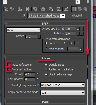
Alternatively, to use glossiness without reflections, one can simply enable the “highlights+FG only” function.
To use glossiness without reflections in Vray, users should simply disable the "Trace reflections" and the "Trace refractions" functions, under the "Options" rollout.
Note: For complex/more realistic glossy highlights and/or reflections, users should also plug the bump or displacement texture (e.g. greyscale) into the "glossiness" and/or the "Reflectivity" toggle of the “Reflection” group parameters.
Depending on its render results, one may choose to Invert its colour in the "Bitmap" "Output" rollout.
This 3Ds Max function is covered in the "Converting a Vray Max scene to mental ray" article.
Alternatively, use a separate grey scale bump or displacement texture with less contrast. And/or mixed with other proprietary procedural materials.
Note: Once a greyscale texture/bitmap is applied to the toggle, it will automatically override the function's numerical values (e.g. reflection, glossiness, etc).
The Reflectivity and/or the Glossiness will be based on the greyscale texture/bitmap information( e.g. Less bitmap Contrast= diffused reflections/glossiness results;
More bitmap Contrast= sharper/linear results).


Users can also use a similar approach in VRay:

Also, to further control the amount of reflections on any given surface, one can use the “custom reflectivity" function from the BRDF rollout.
This function works in conjunction with the “main material parameters” rollout.

To control the amount of reflections in Vray, users should click and hold the "Reflect" colour swatch of the "Reflection" group first. Its "Colour Selection: reflection" dialog should appear.
To increase reflectivity, simply select and drag down its slider towards the white colour: 100% White equals to full reflectivity; and 100% black equals to NO reflectivity.

To prevent artifacts on glossy reflections, users should focus mainly on increasing the Fast Glossy interpolation density to “1 (same as rendering)” or higher. If necessary, also use the global “glossy reflections precision” and “Glossy refractions precision”.


To prevent reflection/glossy artifacts in VRay, users should simply go the "Reflection" group and increase its default "Subdivs" values from 8 to 16 or higher, if necessary.

In addition, one should also increase the "V-Ray Image sampler (Antialiasing)" values to correct reflection/glossy artifacts.

Finally, it's also worth pointing out that rendering images lower than 3500 pixels may cause the renders to look slightly grainy (especially when rendering in interior scenes), independently of the high settings on material.
To prevent this, simply render at 3500 pixels or higher. If required, one could later reduce its original size proportionally, in Photoshop.
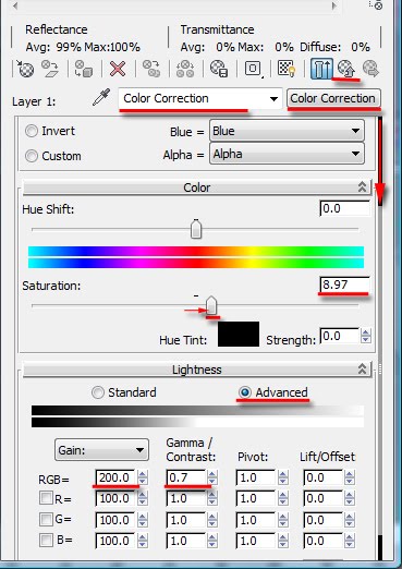
Colours: In addition to using Photoshop to correct colours;etc, one should also use the “Composite” or “Color Correction” shader.
“Colour bleeding”;excessive reflections; GI and/or Final gather can at times change the original colour/s of textures in the render.
Using the "Color Correction” shader will help rectify most colour related problems. This shader is often plugged in the shader's main diffuse toggle .
Furthermore, the materials’ “indirect illumination options” function can also help emulate the apparent physical properties of an object (e.g. these values can be positive or negative, depending on the intended effect).

In VRay, Users can achieve similar results by using the "VRayMtlWrapper" on top of an existing "VRayMtl"shader.

Render elements and Post-production work: Rendered elements and Post-production work often help enhance and address final touches of previously rendered images/materials. Some of the most common render elements used are “reflections”, “Z depth” , “object ID”, “AO”, “refractions”, "matte”, etc.
It's worth pointing out that rendered elements increase the rendering times.


The two images below depict the importance of using professional photo references in order to use the techniques mentioned earlier.
The first image below was a photo reference supplied by the client; and the second image is the final rendered image.


Note that, although the scheme was similar to the above photo reference, some of the textures/colours and design were changed by the client.
I have used additional photo references as guide to emulate the physical properties of most objects in the scene (e.g. chairs, wall, glass, etc.).
I hope you have found this article interesting!
Video Captions available (CC)
Video Captions available (CC)
Video Captions available (CC)
Video Captions available (CC)


I have just published a New Book with Taylor & Francis/CRC Press, entitled,
V-Ray 5 for 3ds Max 2020: 3D Rendering Workflows
Click on the image below to find out more about my new book.
Checkout below my other Courses with High Resolution Videos, 3d Project files and Textures included.
Also, please Join my Patreon page or Gumroad page to download Courses; Project files; Watch more Videos and receive Technical Support. Finally, check my New channels below:


![]()


Important Terminologies & Descriptions:
3d Rendering: Is the process of converting the three dimensional (3D) data seen in a 3d scene into 2D image/s (rasterized).
The rasterization process include, the rendering parameters, the rendering engine, lights, 3d models, textures, shaders, and other effects.
3D renders can be a sequence of animated objects/effects/cameras, or a single frame with a still camera and object/s.
Some of the articles, Videos and Tutorials depicted here will take you through the process of rendering.
Photorealistic Rendering: Is the Process or Art of making a typical Computer Generated Image/render (CGI) look indistinguishable from a real photo.
To achieve this, users often need to possess the skills and the"eye" to appreciate good photography, cameras, composition, lighting, shaders, materials, 3d modelling, rendering and have some post-production skills.
Some of the articles, Videos and Tutorials depicted here will help you achieve truly photorealistic renderings.
Post-Production: Is the process of creating effects or/and results after/post the main process.
This terminology can be used to describe the results (post-production) of main processes such as 3d renderings and/or filming a scene.
The post-production often takes place in applications such as Photoshop, After Effects, Nuke, etc.
Some of the articles, Videos and Tutorials depicted here will take you through the process.
Architectural Rendering, or architectural illustration/Visualization, is the art/process of creating two-dimensional images or animations depicting the attributes of an architectural design, while using state of the art applications such as, Autocad, 3ds max, VRay, Cinema 4d, Blender, Maya, Corona, Photoshop, etc
Some of the articles, Videos and Tutorials depicted here will take you through this amazing process.
Textures: Is a term often used to describe photographed 2d images to be later used in a toggle of a shader or procedural map.
Textures can be used in the Diffuse toggle, Reflect, Glossy effects, Bump, Displacement, etc.
Some of the articles, Videos and Tutorials depicted here will take you through the process of applying textures.
Materials: Is a term often used to describe maps, textures,procedural maps or shaders, depending on the context the term is being used.
Some of the articles, Videos and Tutorials depicted here will take you through the process of applying materials.
Procedural materials: Is a term often used to describe maps with editable/proprietary parameters/functions.
Some of the articles, Videos and Tutorials depicted here will take you through the process of applying procedural materials.
Shaders: Is a term often used to describe complex materials with functions and procedural maps created for a specific purpose.
Some of the articles, Videos and Tutorials depicted here will take you through the process of applying shaders.
Architectural Rendering, or architectural illustration/Visualization, is the art/process of creating two-dimensional images or animations depicting the attributes of an architectural design, while using state of the art applications such as, Autocad, 3ds max, VRay, Cinema 4d, Blender, Maya, Corona, Photoshop, etc
Some of the articles, Videos and Tutorials depicted here will take you through this amazing process.
Studio Lights are fundamental in the process of creating appealing images/renders.
The overall lighting determines not only the brightness and the darkness; but also the tone, mood and the atmosphere of a scene.
Hence the importance to control and manipulate the lights accordingly, in order to fully capture the textures and the vibrancy of your objects.
By distributing the shadows and the highlights accurately, you can achieve truly appealing images/renders.
Some of the articles, Videos and Tutorials depicted here will take you through the process of creating and applying Studio Lights.
In addition, there is a huge online support for this software, and countless online sites with tips and tutorials.
Finally, there are readily available books, online/college courses, and its full documentation at Adobe.com
Verified View/s: Is an accurate Photomontage of a proposed design/building, using the Guidelines for Landscape and Visual Impact Assessment (GLVIA3).
Photomontage in 3d Visualization: Is the process of incorporating a 3d object/design/building into a 2d image/photo, while matching the camera angle/settings, position and the overall lighting depicted in the 2d photo.
This laborious process often requires the usage of a 2d and a 3d application.
To create an accurate Photomontage/Verified View, the 3d Visualizer/specialist needs a: 3d context model to plot/plan the shots; a photo of the location in question; the survey data; camera information; a 2d and a 3d application to create the Final Verified View/s .
Some of the articles, Videos and Tutorials depicted here will take you through the process.
Planning Applications: These can be used to find out whether a proposed development is likely to be approved by the planning authority, before substantial costs are incurred developing a detailed design.
Planning Permissions: Is the legal process of determining whether proposed developments should be permitted. Responsibility for planning lies with local planning authorities (usually the planning department of the district or borough council). The legislation, policy and guidance that underpins planning in England can be found on the government's National Planning Practice Guidance
A 3d Visualiser works within the realm of 3d visualization, a sector of the Computer Graphics Industry (or CGI) that is primarily concerned with the visual presentation of design concepts and ideas. And a company within the 3d visualisation sector offers to its customers (among many things) 3d Visualization Services.
Interior design is the art and science of enhancing the interior of a building or/and a space to achieve a more aesthetically pleasing and comfortable environment for those using the space.
An interior designer is someone who plans, researches, coordinates, and manages such projects. Interior design is a multifaceted profession that includes conceptual development, space planning, site inspections, programming, research, communicating with the stakeholders of a project, construction management, and execution of the design.
 |
Course 1: Exterior Daylight with V-Ray + 3ds Max + Photoshop  |
| Course 3: Exterior Night with V-Ray + 3ds Max + Photoshop |
| Course 4: Interior Daylight with V-Ray + 3ds Max + Photoshop |
 |
| Course 5: Interior Night with V-Ray + 3ds Max + Photoshop |

|


Also, please Join my Patreon page or Gumroad page to download Courses; Project files; Watch more Videos and receive Technical Support. Finally, check my New channels below:


3d Rendering: Is the process of converting the three dimensional (3D) data seen in a 3d scene into 2D image/s (rasterized).
The rasterization process include, the rendering parameters, the rendering engine, lights, 3d models, textures, shaders, and other effects.
3D renders can be a sequence of animated objects/effects/cameras, or a single frame with a still camera and object/s.
Some of the articles, Videos and Tutorials depicted here will take you through the process of rendering.
Photorealistic Rendering: Is the Process or Art of making a typical Computer Generated Image/render (CGI) look indistinguishable from a real photo.
To achieve this, users often need to possess the skills and the"eye" to appreciate good photography, cameras, composition, lighting, shaders, materials, 3d modelling, rendering and have some post-production skills.
Some of the articles, Videos and Tutorials depicted here will help you achieve truly photorealistic renderings.
Post-Production: Is the process of creating effects or/and results after/post the main process.
This terminology can be used to describe the results (post-production) of main processes such as 3d renderings and/or filming a scene.
The post-production often takes place in applications such as Photoshop, After Effects, Nuke, etc.
Some of the articles, Videos and Tutorials depicted here will take you through the process.
Architectural Rendering, or architectural illustration/Visualization, is the art/process of creating two-dimensional images or animations depicting the attributes of an architectural design, while using state of the art applications such as, Autocad, 3ds max, VRay, Cinema 4d, Blender, Maya, Corona, Photoshop, etc
Some of the articles, Videos and Tutorials depicted here will take you through this amazing process.
Textures: Is a term often used to describe photographed 2d images to be later used in a toggle of a shader or procedural map.
Textures can be used in the Diffuse toggle, Reflect, Glossy effects, Bump, Displacement, etc.
Some of the articles, Videos and Tutorials depicted here will take you through the process of applying textures.
Materials: Is a term often used to describe maps, textures,procedural maps or shaders, depending on the context the term is being used.
Some of the articles, Videos and Tutorials depicted here will take you through the process of applying materials.
Procedural materials: Is a term often used to describe maps with editable/proprietary parameters/functions.
Some of the articles, Videos and Tutorials depicted here will take you through the process of applying procedural materials.
Shaders: Is a term often used to describe complex materials with functions and procedural maps created for a specific purpose.
Some of the articles, Videos and Tutorials depicted here will take you through the process of applying shaders.
Architectural Rendering, or architectural illustration/Visualization, is the art/process of creating two-dimensional images or animations depicting the attributes of an architectural design, while using state of the art applications such as, Autocad, 3ds max, VRay, Cinema 4d, Blender, Maya, Corona, Photoshop, etc
Some of the articles, Videos and Tutorials depicted here will take you through this amazing process.
Studio Lights are fundamental in the process of creating appealing images/renders.
The overall lighting determines not only the brightness and the darkness; but also the tone, mood and the atmosphere of a scene.
Hence the importance to control and manipulate the lights accordingly, in order to fully capture the textures and the vibrancy of your objects.
By distributing the shadows and the highlights accurately, you can achieve truly appealing images/renders.
Some of the articles, Videos and Tutorials depicted here will take you through the process of creating and applying Studio Lights.
V-Ray: Is a rendering engine that uses global illumination
algorithms, including path tracing, photon mapping, irradiance maps and
directly computed global illumination.
Furthermore, it is used as a commercial plug-in for
third-party 3D computer graphics software applications such as 3ds max, Maya, Houdini, Blender, Nuke, etc, for
visualizations and computer graphics in industries such as media,
entertainment, film and video game production, industrial design, product
design and architecture.
3ds Max: Autodesk 3ds Max, formerly 3D Studio and 3D Studio Max, is a
professional 3D computer graphics program designed to create 3D animations,
models, games and images.
In addition, it has modelling, animation and movie effects
capabilities, frequently used by video game developers, TV commercial studios
and architectural visualization studios.
3ds Max also features shaders, dynamic simulations, particle
systems, plug-ins, and much more, with its own scripting language.
Adobe Photoshop: Photoshop is a powerful raster based graphics program produced by the Adobe Corporation.
It
is widely used for a variety of photo/image editing purposes worldwide.
The program has a huge number of filters, functions, plug-ins, scripts,
etc.In addition, there is a huge online support for this software, and countless online sites with tips and tutorials.
Finally, there are readily available books, online/college courses, and its full documentation at Adobe.com
Verified View/s: Is an accurate Photomontage of a proposed design/building, using the Guidelines for Landscape and Visual Impact Assessment (GLVIA3).
Photomontage in 3d Visualization: Is the process of incorporating a 3d object/design/building into a 2d image/photo, while matching the camera angle/settings, position and the overall lighting depicted in the 2d photo.
This laborious process often requires the usage of a 2d and a 3d application.
To create an accurate Photomontage/Verified View, the 3d Visualizer/specialist needs a: 3d context model to plot/plan the shots; a photo of the location in question; the survey data; camera information; a 2d and a 3d application to create the Final Verified View/s .
Some of the articles, Videos and Tutorials depicted here will take you through the process.
Planning Applications: These can be used to find out whether a proposed development is likely to be approved by the planning authority, before substantial costs are incurred developing a detailed design.
Planning Permissions: Is the legal process of determining whether proposed developments should be permitted. Responsibility for planning lies with local planning authorities (usually the planning department of the district or borough council). The legislation, policy and guidance that underpins planning in England can be found on the government's National Planning Practice Guidance
A 3d Visualiser works within the realm of 3d visualization, a sector of the Computer Graphics Industry (or CGI) that is primarily concerned with the visual presentation of design concepts and ideas. And a company within the 3d visualisation sector offers to its customers (among many things) 3d Visualization Services.
Interior design is the art and science of enhancing the interior of a building or/and a space to achieve a more aesthetically pleasing and comfortable environment for those using the space.
An interior designer is someone who plans, researches, coordinates, and manages such projects. Interior design is a multifaceted profession that includes conceptual development, space planning, site inspections, programming, research, communicating with the stakeholders of a project, construction management, and execution of the design.
More tips and Tricks:
Post-production techniques
Tips & tricks for architectural Visualisation: Part 1
Essential tips & tricks for VRay & mental ray
Photorealistic Rendering
Creating Customised IES lights
Creating a velvet/suede material
FoxRenderfarm
www.arroway-textures.com
Renderpeople
Gobotree
.
Thank u so much , great post very usefull.
ReplyDeleteExcellent informative article! Great Mentalray tips. Thanls for sharing!
ReplyDeleteHi Alejo and Scott,
ReplyDeleteThank you very much for your kind comments; I really appreciate it!!
Ta
Thanks, though I'm a very user but in principles this gives me really great insights, thanks again Mr. Cardoso.
ReplyDeleteArjun
You're Welcome Arjun. Thanks for weighing in on the discussion!!!!
ReplyDeleteBy the way, click on the "Home" page to check my new article about V-Ray. You may also find it interesting!
Cheers
J
Hi Jamie
ReplyDeleteI've never heard about the issue with grainy renders below 3500 px. Could you expand on that in a future post?
Love your blog!
Hi Thomas,
ReplyDeleteYour comments are much appreciated!!!
Yes, I will try to elaborate further on the subject.
Ta